The expense analysis is designed to assist users in their daily financial management. Easily configurable graphs allow Lydia customers to visualize their spending patterns at a glance from the homepage, helping them better manage their budgets.

How the expense analysis works
Make the most of the expense analysis
Users can access the main view from the app's homepage, provided they have a Lydia card (physical, virtual, or contactless). Clicking on the graph provides a detailed breakdown of expenses.
- Users can scroll the graph horizontally to access past months and weeks.
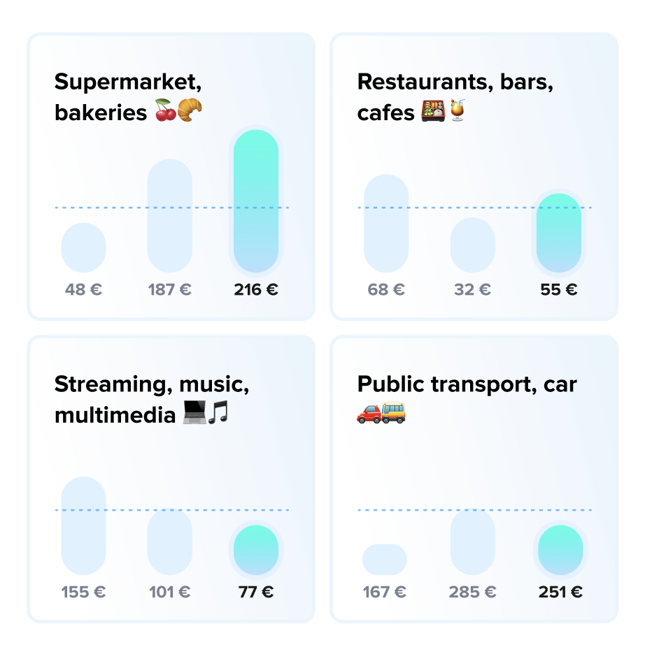
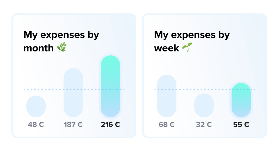
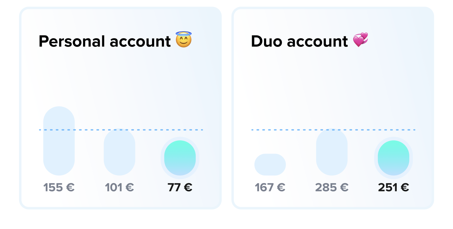
- Clicking on the columns of the graph reveals expenditure details. All card payments (physical, virtual, and contactless) are represented on the graph, while bank transfers are not.
- The dotted line represents the average amount spent per card over the last 5 displayed and completed periods.

Customizing Your Analysis
By default, the main view displays monthly expenses across all accounts. To personalize this display, users can modify the following:
- Accounts: Select the Lydia account(s) they want to view.
- Filters: Choose the expense category/categories of interest.
- Period: Select the time scale for analysis, either monthly or weekly.
- Recurring Payments: Choose whether or not to include recurring payments in the analysis (such as Netflix or Spotify subscriptions, for example).
Accessing the full analysis
Users with a paid Lydia subscription and a Lydia card (physical, virtual, or contactless) can add multiple views to their expense analysis.
To do this, simply click on the '+' or 'Add a view' button from the homepage. Users can then edit the title of their new view, modify display settings, and the view will be automatically saved to their homepage.
Display recommendations for paid users
Here are some display suggestions to make the most of multiple views:
- Compare monthly and weekly expenses:
- Compare personal and joint account expenses:
- Compare expense categories: